Prisms.
 
Back

Norvent — Branding for a European wind IPP

Norvent acquires Europe's first generation of onshore wind farms and repowers them: fewer turbines, more output, same ground. We built the brand around that single idea. A positioning that reframes the category, a visual system built on the plan-view site map, and a document suite designed for the two audiences that decide these deals: capital and community.
Year2026
ClientNorvent
The Norvent logotype over a misted valley of onshore wind turbines

Problem

Every wind brand in Europe sells new capacity. They all look the same: turbines at golden hour, sustainability language, no numbers. Norvent does not sell new capacity. It buys ageing assets whose real value is invisible in a photograph, the land lease, the grid connection, the planning consent already in place.
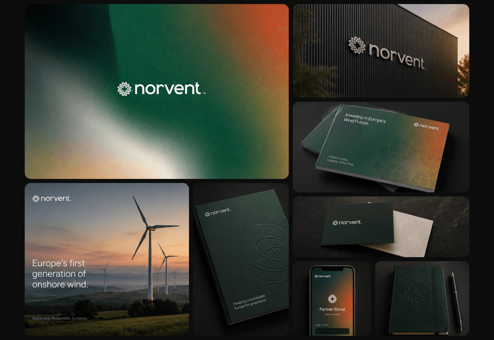
The Norvent identity applied across building signage, an investor brochure, business cards, the partner portal app and an embossed notebook
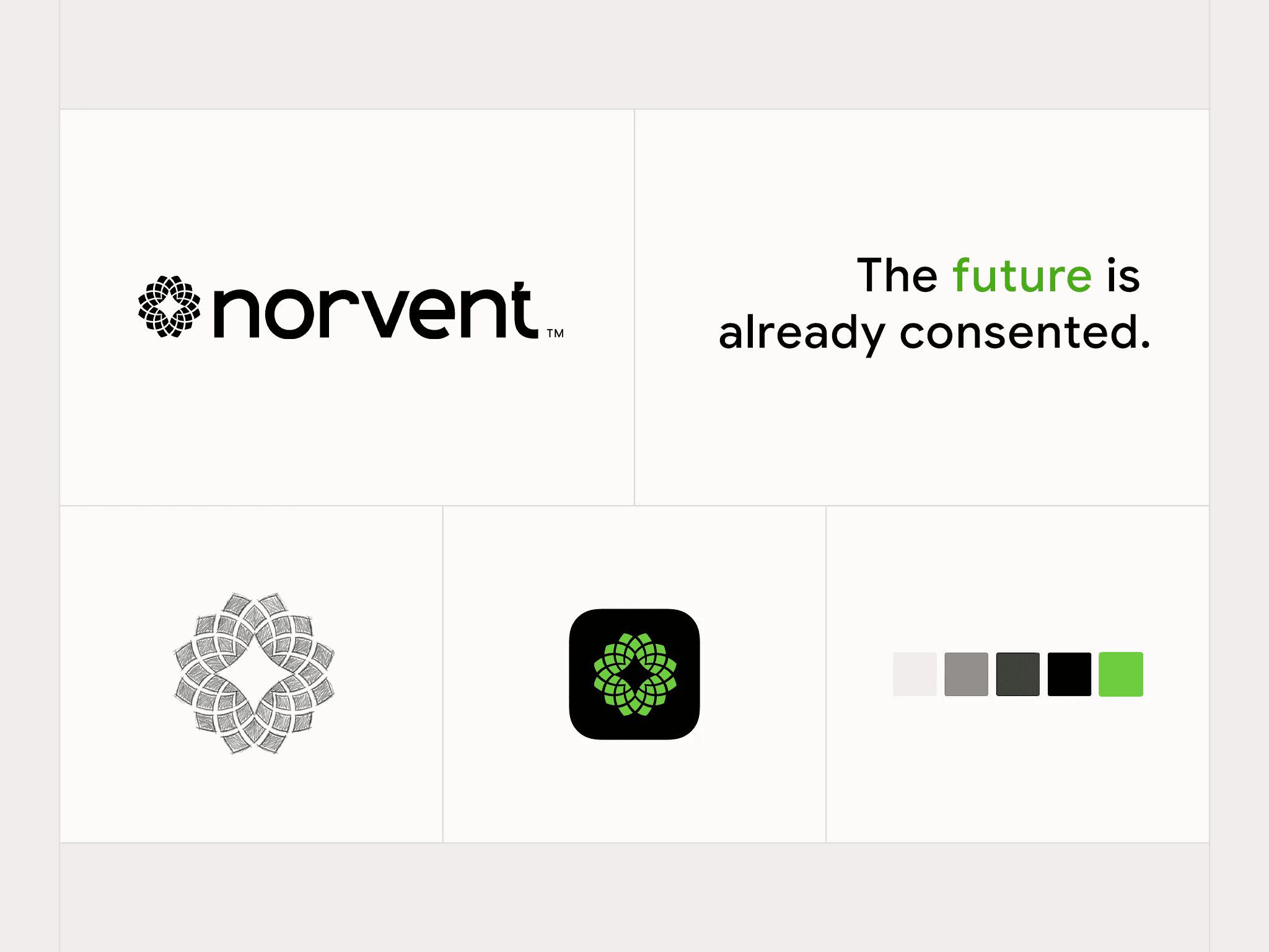
Norvent brand system sheet — logotype, the line “The future is already consented.”, the rosette mark drawn as a plan-view site map, app icon and colour palette
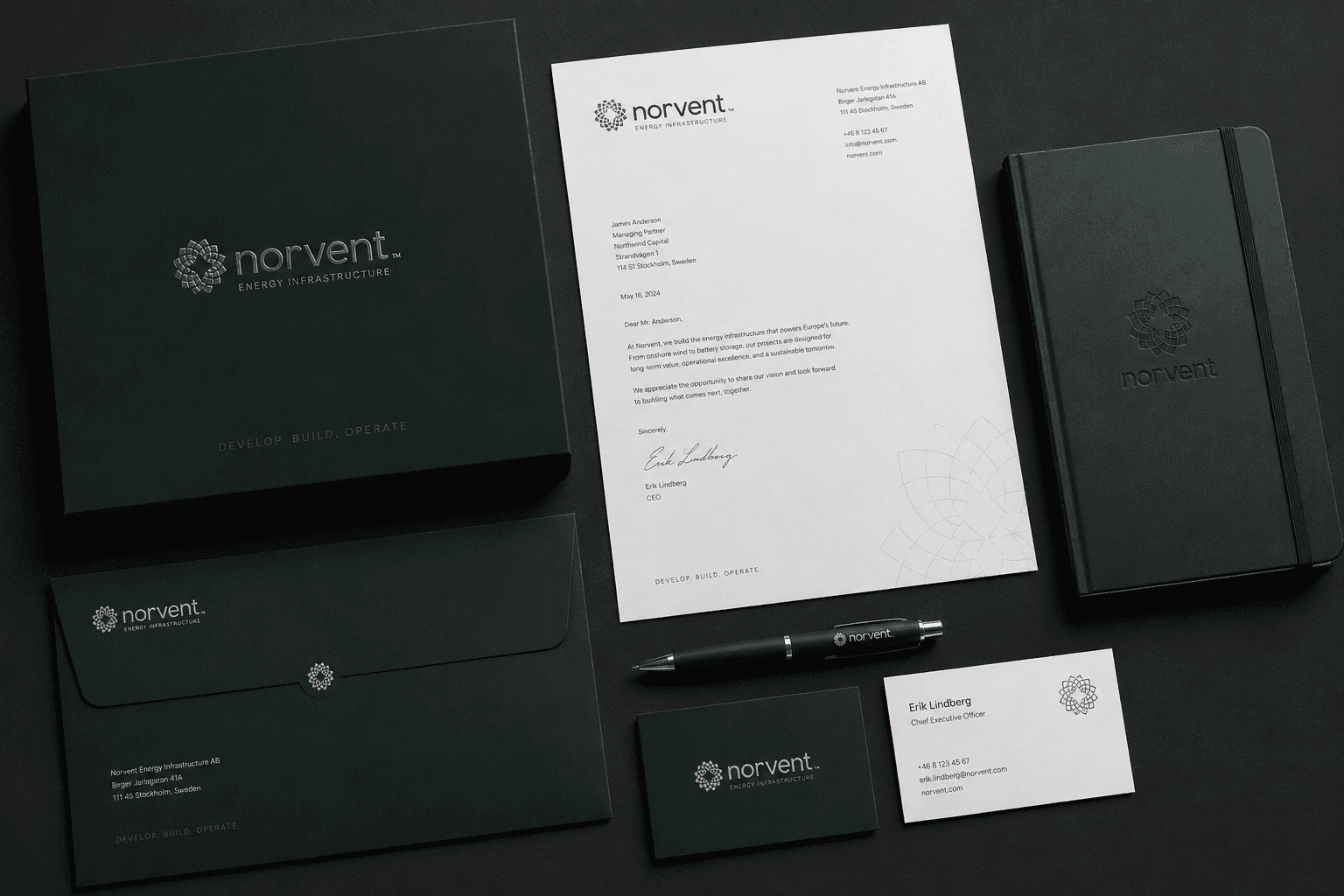
Norvent stationery laid out on black — a presentation box, letterhead, envelope, notebook, pen and business cards in forest green with a silver rosette
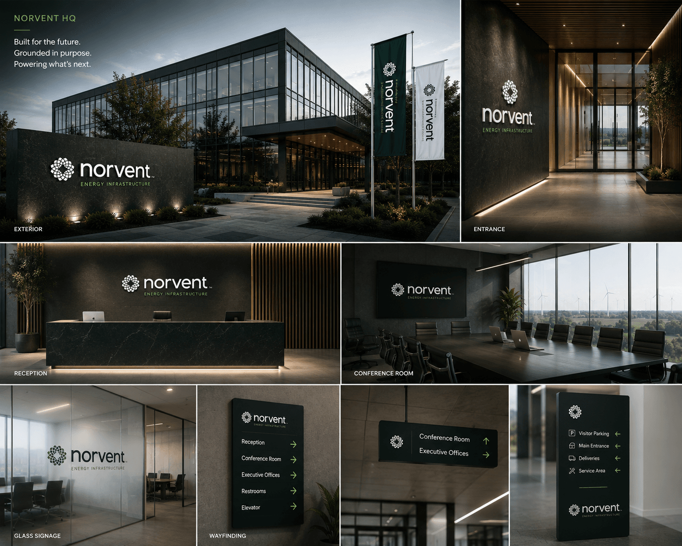
Norvent headquarters board — the exterior and lit entrance, reception desk, conference room overlooking a wind farm, and the glass and wayfinding signage
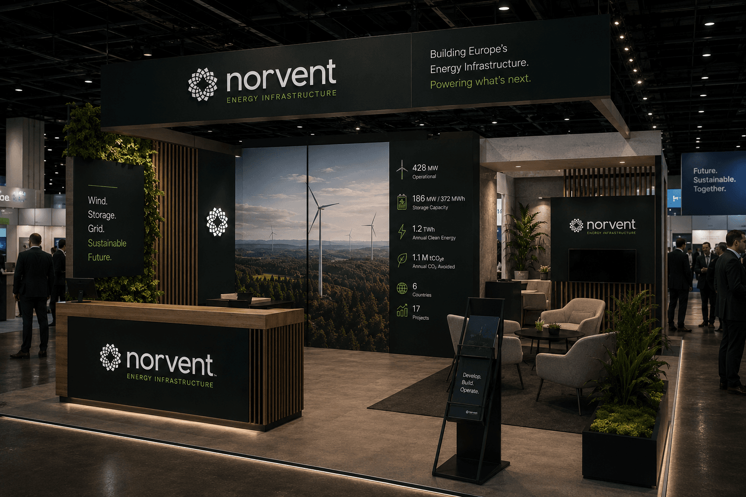
The Norvent trade show stand — a green backdrop of wind turbines with capacity, storage and project figures, a planted meeting lounge and a branded welcome desk

Outcome

A positioning line that does the selling before a deck opens: the best place to build a wind farm is where one already stands. The Norvent Register, a public annual index of European onshore wind reaching end of life. It positions Norvent as the house that knows where every ageing asset sits, which is exactly the authority a repowering acquirer needs, and it gives the brand a reason to publish every year.
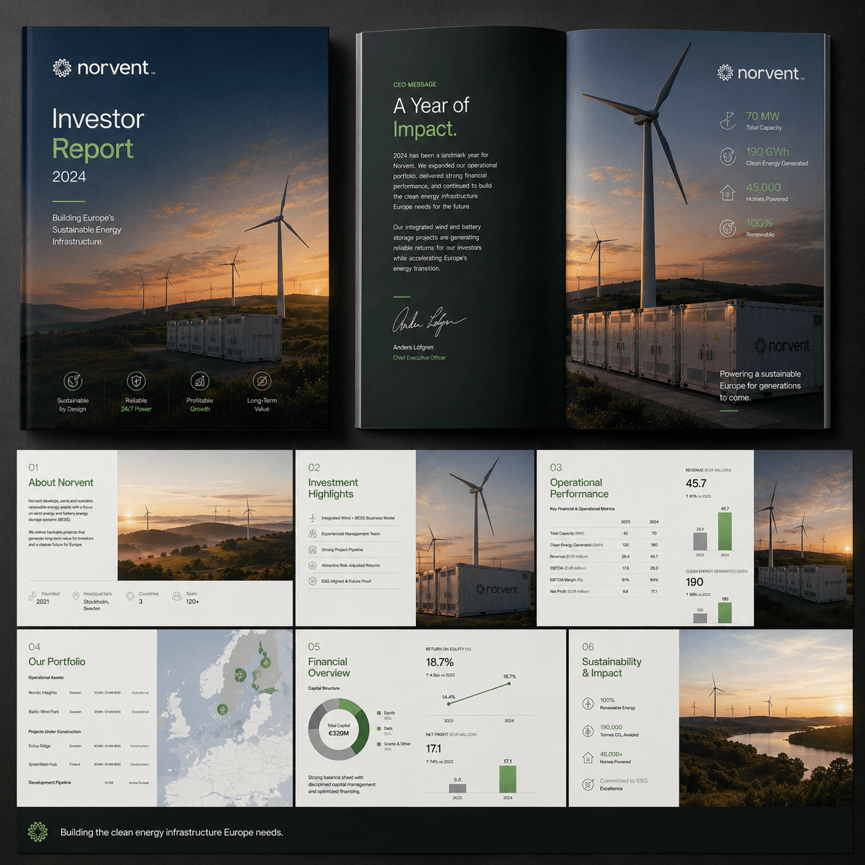
The Norvent Investor Report — cover, CEO letter spread and deck pages covering the portfolio map, operational metrics and financials
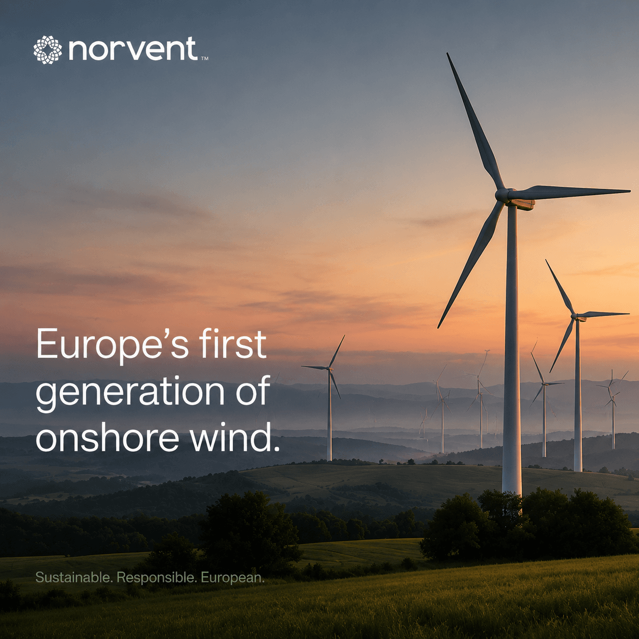
Campaign shot — “Europe's first generation of onshore wind.” over a wind farm at sunset
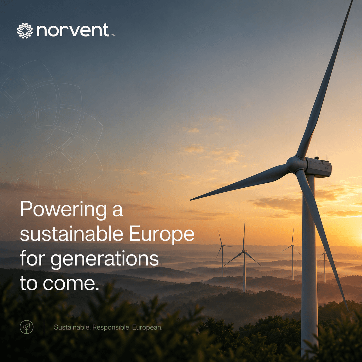
Campaign shot — “Powering a sustainable Europe for generations to come.” over a misted ridge of turbines
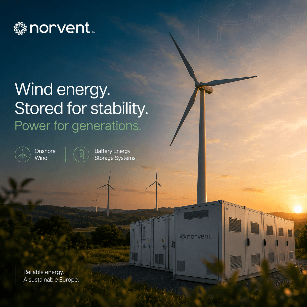
Campaign shot — “Wind energy. Stored for stability.” with the onshore wind and battery storage marks over a turbine and BESS units
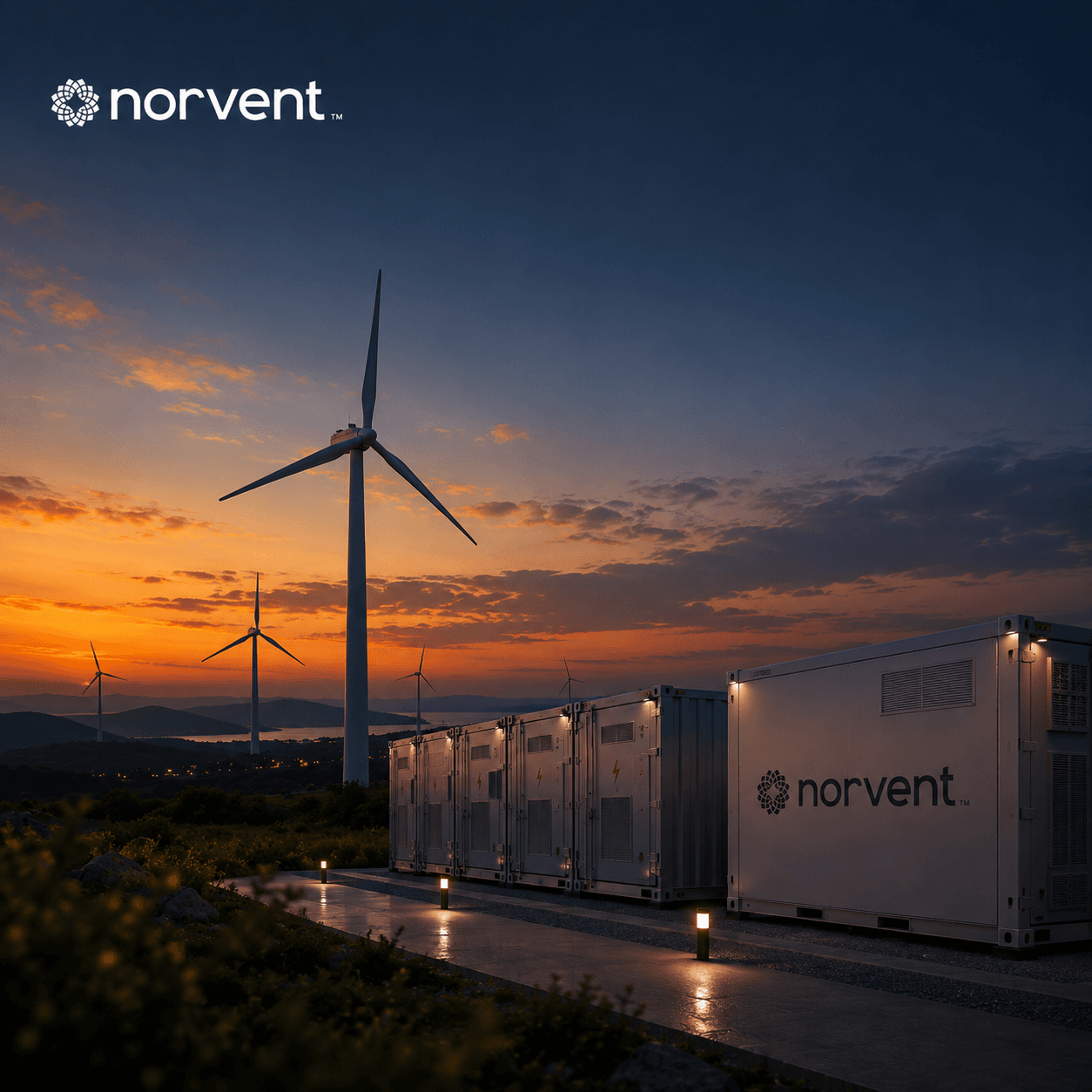
Branded battery storage units beside a turbine at dusk